时光方糖
TIME CUBE
AZEPAM 广州东山口店
时间 :2024.05-2024.07
位置 :广东省广州市越秀区 庙前西街行政街路 巷里四十八号
面积 :91.5 平米
客户 :AZEPAM
状态:已建成
设计团队:关赫嘉,李尧,栾东泽
灯光设计:张帆工作室
文字:陈家欣、 Ming
摄影 :立明
时间 :2024.05-2024.07
位置 :广东省广州市越秀区 庙前西街行政街路 巷里四十八号
面积 :91.5 平米
客户 :AZEPAM
状态:已建成
设计团队:关赫嘉,李尧,栾东泽
灯光设计:张帆工作室
文字:陈家欣、 Ming
摄影 :立明
AZEPAM @DONGSHANKOU GUAGNZHOU
TIME: 2024.05-2024.07
LOCATION:@DONGSHANKOU, Huangzhou, Guangdong
AREA:91.5㎡
CLIENT: AZEPAM
STATUS:Completed
DESIGN TEAM:Hejia Guan, Yao Li, Dongze Luan
LIGHTING DESIGN:Zhangfan Studio
Text:Jiaxin Chen, Ming
PHOTOGRAPH: Lingming Fang
TIME: 2024.05-2024.07
LOCATION:@DONGSHANKOU, Huangzhou, Guangdong
AREA:91.5㎡
CLIENT: AZEPAM
STATUS:Completed
DESIGN TEAM:Hejia Guan, Yao Li, Dongze Luan
LIGHTING DESIGN:Zhangfan Studio
Text:Jiaxin Chen, Ming
PHOTOGRAPH: Lingming Fang

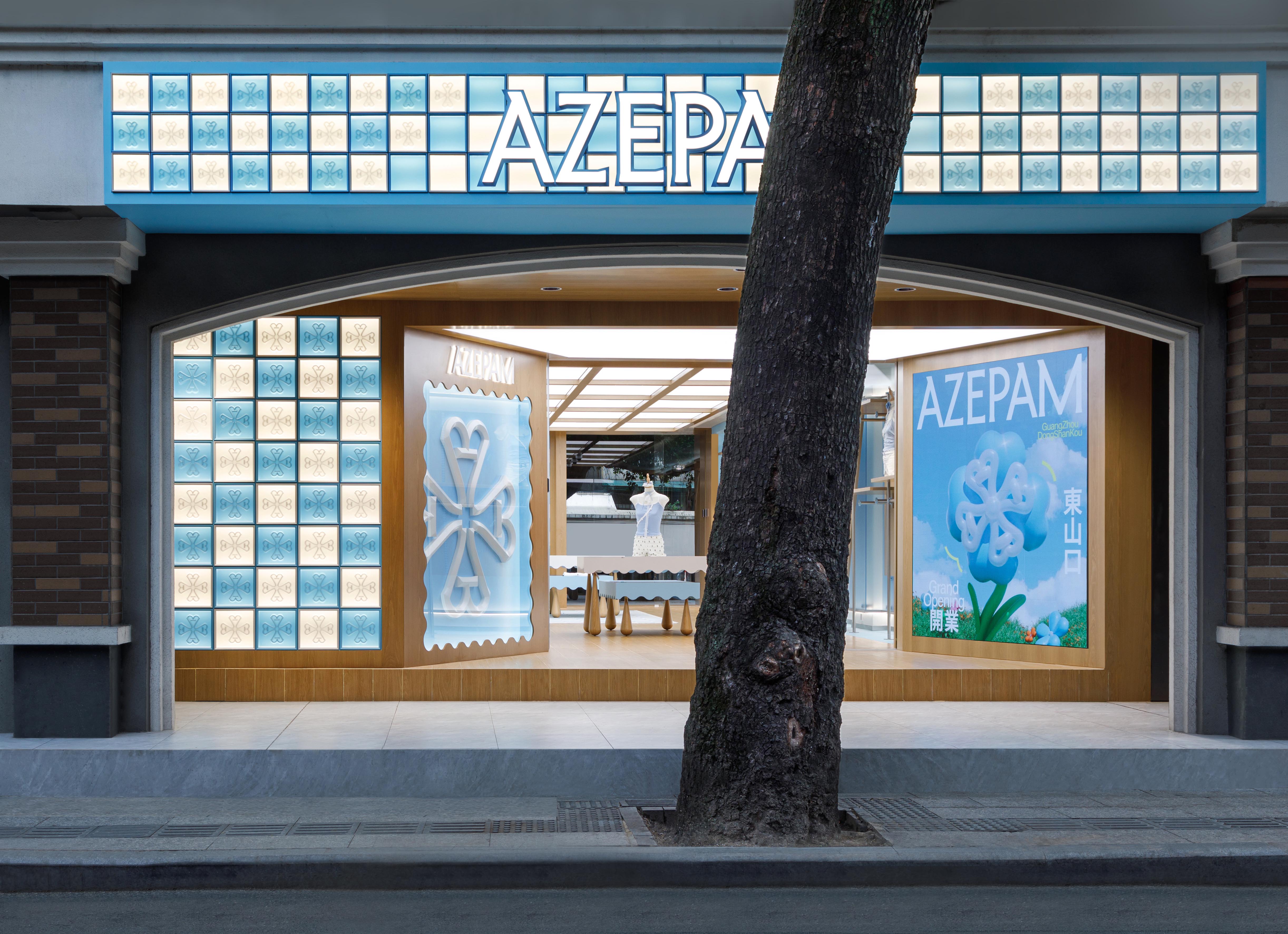
AZEPAM广州东山口分店位于在更新城市区域中的骑楼底层。骑楼作为组成岭城市肌理的古老建筑元素,其首层的店铺和连廊是承载公共活动的重要空间。同时这家店也是AZEPAM品牌全新形象的第一家线下实体店。基于该种城市文化背景和品牌特征我们重新审视了实体零售店铺与城市体验之间的关系。
The AZEPAM Guangzhou Dongshankou branch is situated on the ground floor of an arcade building in an urban renewal area. As a historical architectural element shaping the urban fabric of Lingnan cities, the arcades' ground-level shops and covered walkways serve as vital spaces for public activities. This store also marks the debut of AZEPAM’s new brand identity in its first offline retail location. Grounded in this urban cultural context and brand characteristics, we have re-examined the relationship between physical retail stores and urban experiences.

01 城市的店铺 Urban Storefronts
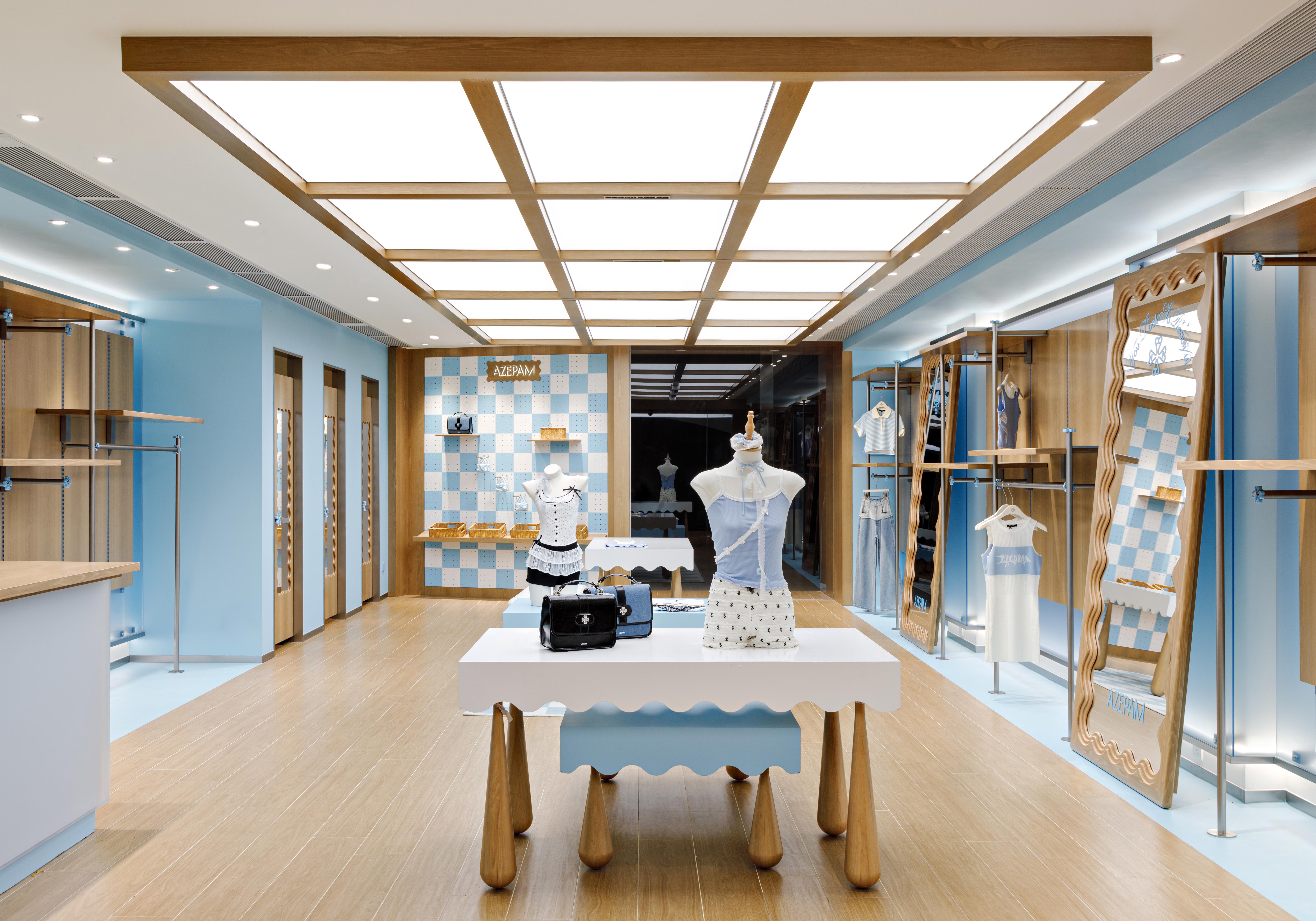
在场地持续更新的社会背景下,我们旨在让店铺成为城市活动载体的新空间。 店铺设置前后两个出口,与骑楼底部的灰空间连接,形成城市空间的一部分。而在氛围的营造中,我们根据已有的品牌颜色与logo造型等元素,营造一个与周围城市环境对比强烈的空间,步入其中如同进入甜美的异托邦,让现代的审美特质焕活古老街区的生命力。
In the context of continuous urban renewal, our goal is to transform the store into a new space that serves as a carrier for urban activities. The store features both front and rear entrances, connecting with the gray space beneath the arcade to integrate as part of the urban fabric. In creating the ambiance, we drew from the brand’s existing color palette and logo design elements to craft a space that starkly contrasts with the surrounding urban environment. Entering the store feels like stepping into a sweet heterotopia, where modern aesthetic qualities revitalize the vitality of the historic neighborhood.
![]()
02 时光方糖 Time Cube
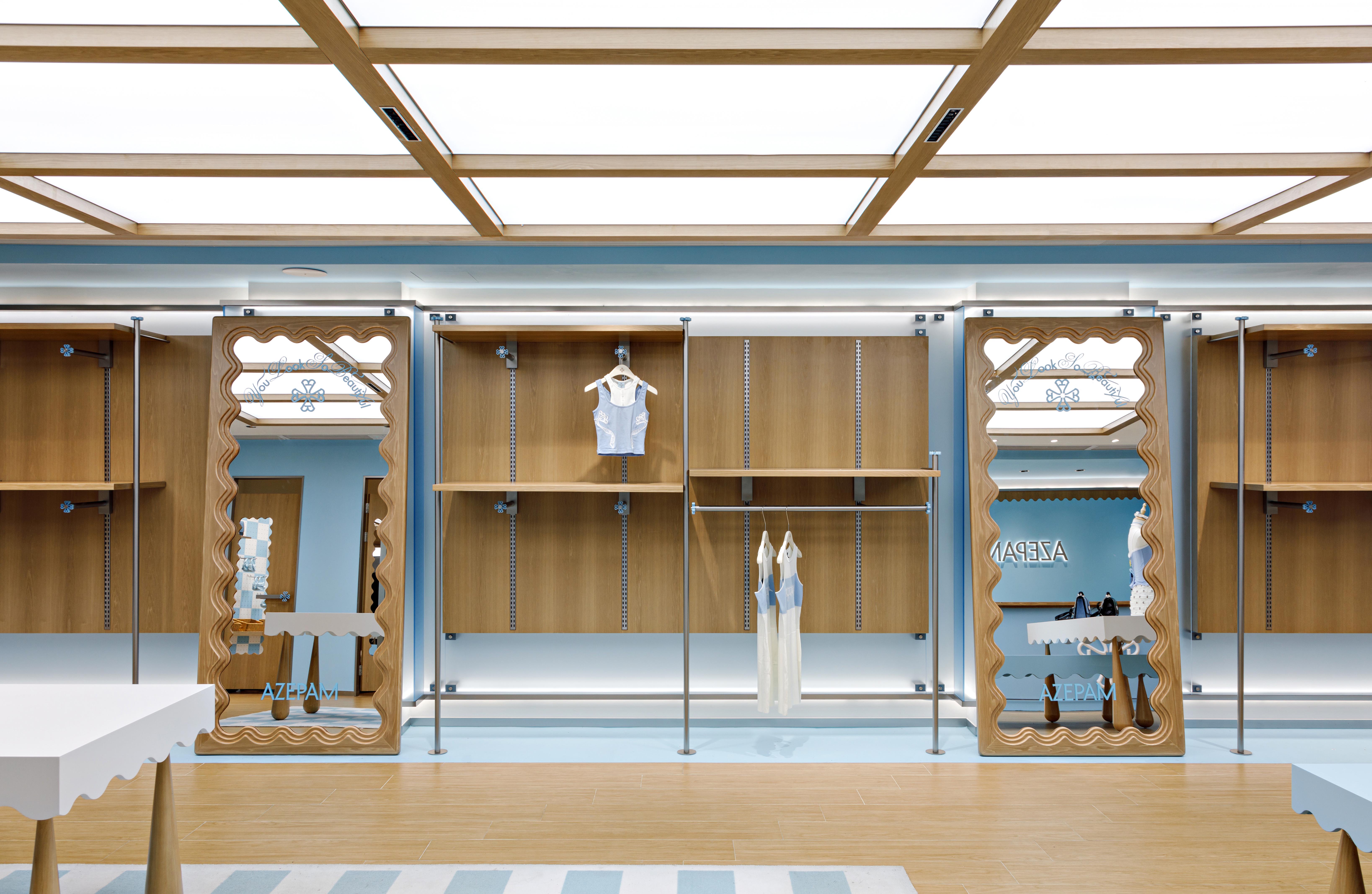
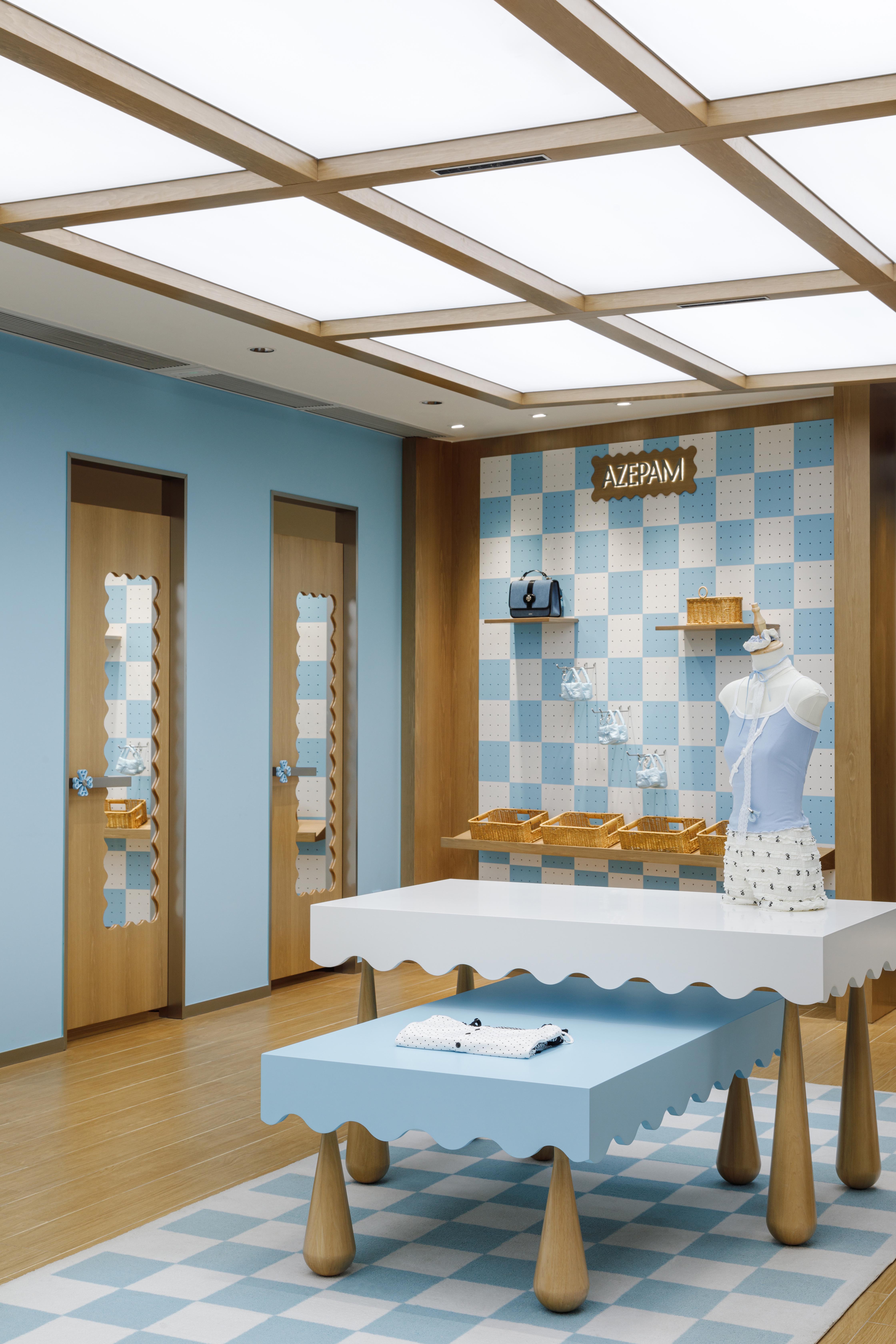
基于AZEPAM品牌甜美复古的特质,我们运用质感和颜色对比强烈的材料转译传统元素,为这个店铺营造街边复古糖果店的氛围。在室内,大量木质材料的运用与主色调蓝色形成鲜明对比。
“堆叠的方糖块”作为主要的设计意向被几何化为“格子”的基本设计语言
。
Inspired by AZEPAM’s sweet and vintage brand character, we employed materials with strong textural and color contrasts to reinterpret traditional elements, creating an atmosphere reminiscent of a retro candy shop along the street.
Inside, the extensive use of wooden materials contrasts sharply with the dominant blue color scheme.

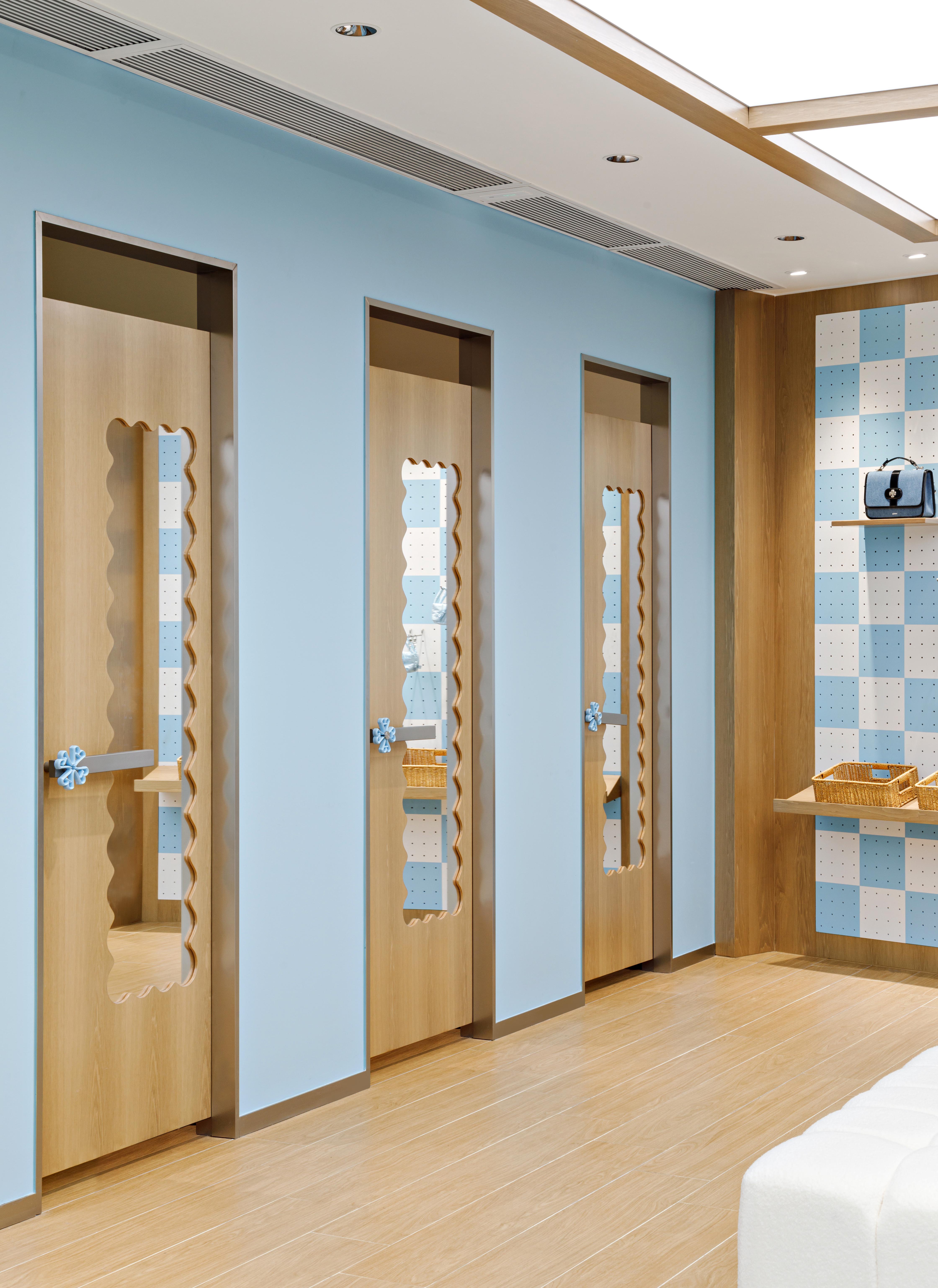
结合品牌主题色,蓝白格让空间有秩序感的同时产生温暖包容的氛围。在前门入口和门楣处,我们运用透明的磨砂材料表现蓝白格子符号,这些透明发光的盒子与室内的实体材料形成对比,增强空间的通透感和层次感,让规整的店铺拥有丰富和谐的空间效果。门头左侧橱窗,试衣镜和收银台背景墙都采用波浪线方框来丰富空间形态,隐喻穿越时间的古老邮票。
The design concept of "stacked sugar cubes" is geometrically translated into a grid-based design language. Combined with the brand’s theme colors, the blue-and-white grid brings a sense of order while fostering a warm and inclusive ambiance. At the front entrance and the doorway lintel, we used frosted transparent materials to represent the blue-and-white grid motif. These illuminated translucent boxes contrast with the solid materials of the interior, enhancing the space’s transparency and depth while adding richness and harmony to the structured layout. On the left side of the facade, the display window, fitting mirror, and the background wall of the cashier counter incorporate wave-framed designs to enrich spatial forms, subtly referencing the imagery of ancient postage stamps, symbolizing a journey through time.

03 空间漫游 Spatial Roaming
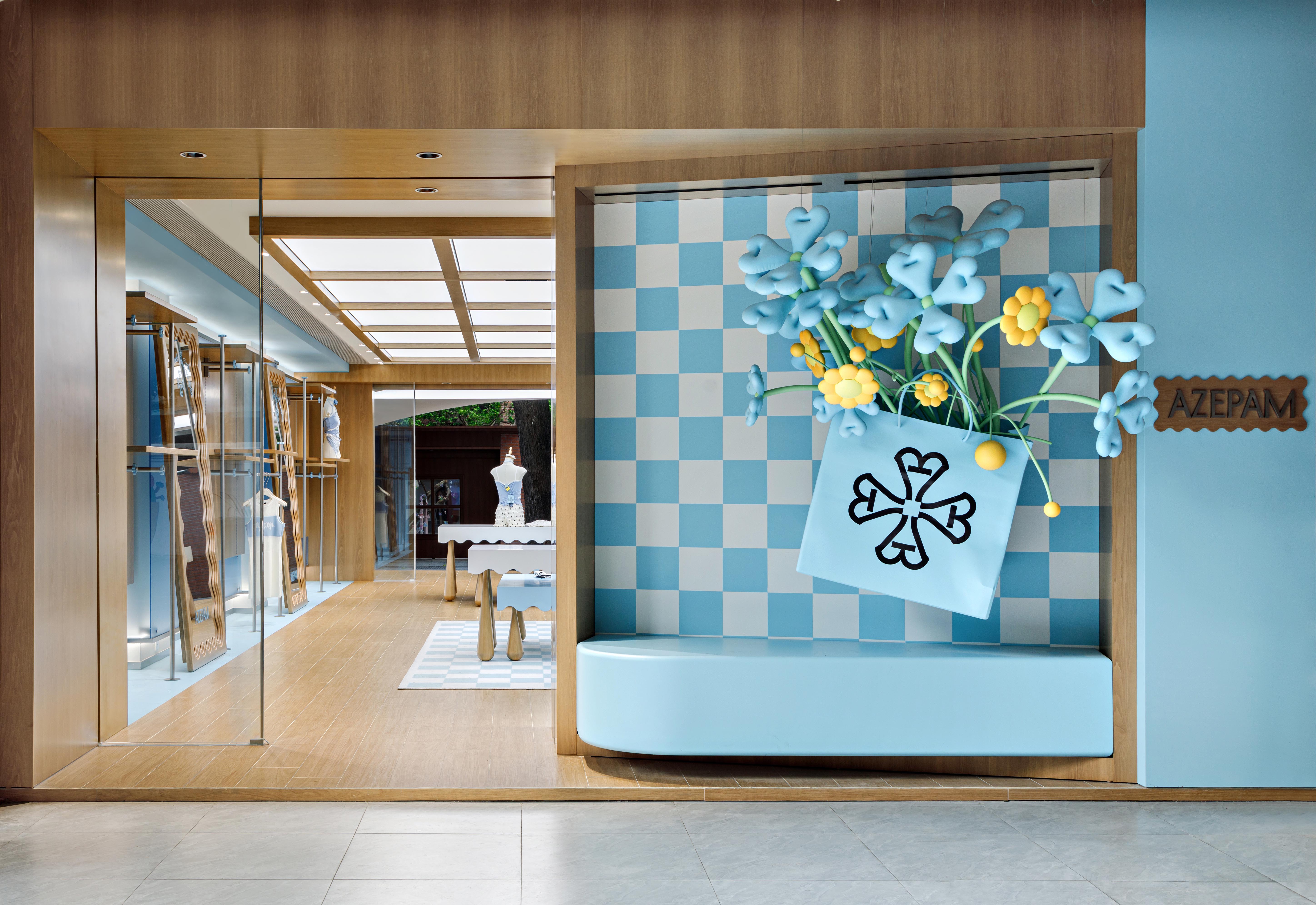
在空间布局上,我们前门入口的两面墙体角度向外打开,同时配合品牌logo图案形成强烈的视觉吸引,将路人的目光迅速引入店内。后门的设计则融入了一组由品牌logo重构变形的袋装花朵装置。运用尺度夸张的装置在前后门给人留下深刻的印象,标志着空间的隐形界面。
In terms of spatial layout, the two walls flanking the front entrance angle outward, complemented by the brand’s logo pattern to create a strong visual draw, quickly directing passersby’s attention into the store. The rear entrance features an installation of oversized floral designs derived from a deconstructed and transformed version of the brand’s logo. These bold, exaggerated installations at both entrances leave a lasting impression, subtly marking the invisible boundary of the space.
![]()
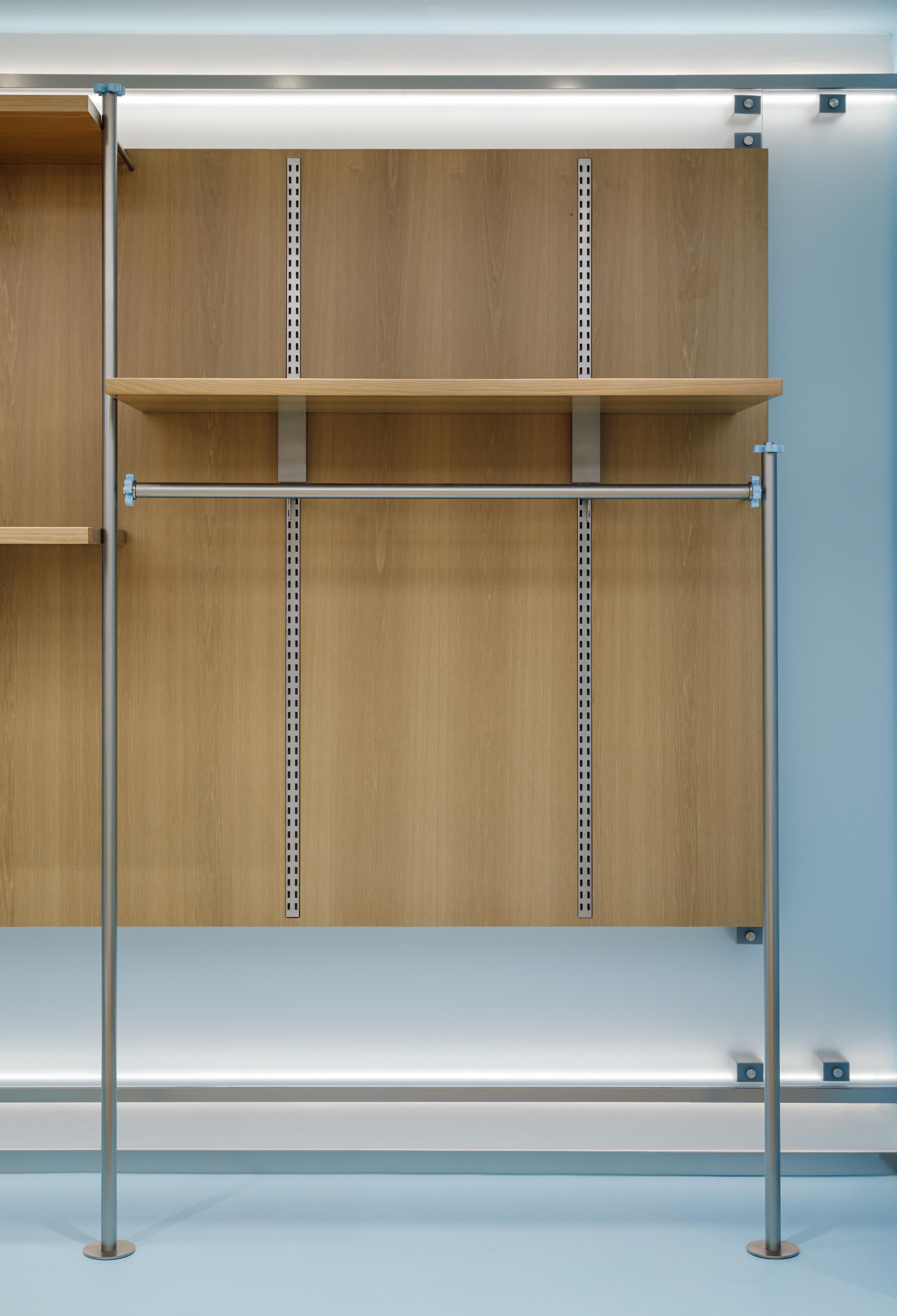
固定的试衣间,收银台和固定通挂等功能空间被布置在空间的两侧,中央空间被释放成灵活的空间用来布置可变化的岛台。使得购物动线成为城市动线的一部分。使用者从店铺中穿过,既是在漫游城市空间的过程中光顾零售店铺,也是在实体店铺购物的同时体验丰富的城市公共活动。
Functional areas such as the fixed fitting room, cashier counter, and permanent hanging displays are arranged along the sides of the store. This frees up the central area as a flexible space to accommodate adaptable island displays. This layout integrates the shopping flow into the urban flow, allowing visitors to experience the store as part of their journey through the city. By passing through the store, customers simultaneously explore a retail space and engage with vibrant urban public activities, blending the acts of shopping and city roaming into a seamless experience.
25–11–2024